Wednesday, September 19, 2007

What's Up With The Rangers?

A reader noted in the comments on an earlier post something interesting with regard to the New York Rangers new Rbk EDGE uniforms.

I was noting that the New York Rangers were the only team in the league which doesn't have images of its new uniforms available online in the NHL.com Shop or any other site that is selling the new Reebok jerseys. Then this official Reebok site came out and it had the first official photos.

Suddenly, as Gabe pointed out, those phoos disappeared from the site and were replaced by a "coming soon" graphic.
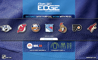


What's stranger is that way back when the Rangers first began taking orders back in July, photos were posted on their web site. Within hours, the photos were removed. Now this.

Luckily, I was able to grab both images before they mysteriously went away, so we've all been able to see them. But I'm just curious as to the reasoning behind these decisions. As Gabe mentioned, are the Rangers planning some big unveiling ceremony they have yet to announce? And if so, for what reason? The jerseys, much like Detroit's remain entirely unchanged — merely adapted to the new EDGE cut.

Regardless, we'll find out for certain what the deal is no later than Friday, as that is the night of the Rangers' first preseason game and they'll surely be wearing them. I'll keep on top of this if anybody is interested. And if you hear or read anything, do let me know, either by email or in the comments of this post.
Concepts For Oilers, Blues, Coyotes

I've got a few concept designs for you to check out this afternoon. We'll start way up north in Alberta and work our way south to Arizona.

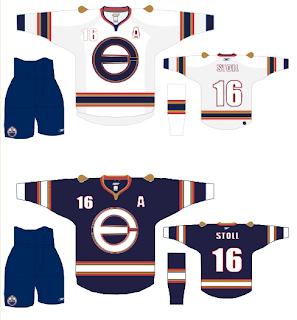
Here's what one designer had in mind for reconfiguring the Edmonton Oilers' logo and uniforms.


It's an "E" merged with an "O" that, quite frankly, might work better as a secondary logo. That isn't to say that the logo found on the shoulder of this jersey wouldn't work just as well. The one big thing that struck me with the Oilers' new Rbk EDGE jerseys is the plainness. I know a lot of people have been commenting on how some of the new sweaters look like practice jerseys, but for the Oilers, that couldn't be more true. The fact that the elbow stripes don't even go completely around the arm just adds to that.

But anyway, we're talking about this concept. And overall, I like it. The logo could use a splash of creativity, I've seen worse. And the oil drop might be a nice addition to the plain uniforms they have now.

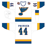
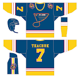
We're moving along to St. Louis now where one fan is mixing the old with the semi-old with the new. Usually when you throw to much stuff in a pot and cook it, the end result is less than delicious. That isn't necessarily the case here, but I don't think the red ever really worked for the Blues.


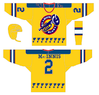
I think those would be solid designs if the red was removed entirely. Now, here's what you don't want to do — with a third jersey or otherwise.


That'll give a person nightmares. It doesn't go the horrifying length as the alternate Blues sweater Mike Keenan vetoed in the '90s, but it sure is trying. Look at those blue notes across the waist.

I like the idea of a trumpet for a secondary logo, but this really isn't the way to go. And how can a team called the Blues have a dark jersey that's anything but blue?

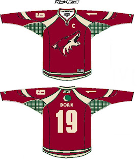
But I say we move on. A Phoenix Coyotes fan recommends reintroducing green into the color scheme. Here's how.


First off, I'm not sure you can put a team logo above the nameplate and have it look good. Secondly, I'm not sure it's even allowed. However, I think it would look just fine on the shoulder. I still like the PHX patch more, but the moon isn't terrible for the other side.

That's all I've got for now. I plan to have more later. Plus, don't forget to check out the Concepts Gallery where you'll find all the work I've posted plus some I haven't.

In Response

Sometimes when I post concept art, I'll make suggestions here or there that speak merely to my own personal preferences. It's cool that every once in a while, someone listens to my suggestions and gives them a shot.

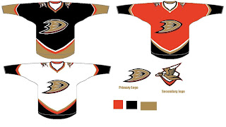
Yesterday, I posted an Anaheim Ducks design I thought was pretty cool, suggesting that instead of gold, the alternate jersey in the set might be better suited for orange. Well today in my email I find that someone gave me what I asked for.


I guess it just proves that some of you out there are actually reading what I write. And I appreciate that.

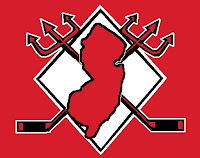
Then, just last week I posted a neat logo concept somebody came up with for the New Jersey Devils. I suggested that it needed something behind it to tie it together better. Then I was emailed this shortly after.


Looks a lot better if you ask me.

Anyway, I guess I just wanted to thank you guys for reading and show you that I do in fact read all my email. By the way, if you've ever written to me and are still awaiting for a response, chances are my feeble memory has forgotten. Just keep bugging me. You can get a hold of me at nhllogos@gmail.com.

EDGE Hindering Players?

Interesting story from Tom Gulitti writing about a recent New Jersey Devils game where new Rbk EDGE jerseys torn in fights may have led to player injuries. I'll let you make your own judgments. You can find his post here.

September 17, 2007

Janssen injures shoulder

Enforcer Cam Janssen might have injured his shoulder tonight because of the league’s new Reebok Edge sweaters. His sweater ripped during his two first period fights with Philadelphia’s Jesse Boulerice. That might have helped Boulerice pull Janssen’s jersey over his head in both altercations and win both decisively. Arron Asham also had his sweater tear during his fight with Riley Cote.

"These new jerseys are supposed to make you faster, but what good are they if they tear that easily,” Mike Rupp said.

"The Devils did not say tonight which shoulder Janssen injured. He missed 12 games last season after dislocating his right shoulder in a fight with Anaheim’s George Parros.
David Clarkson (win over Jason Smith), Asham (loss to Cote) and Rupp (draw with Ben Eager) also fought for the Devils in the first period.

Odds and ends: No one wore the captain’s C or the alternates A’s for the Devils. Patrik Elias, who was captain last season, remained home with Dainius Zubrus, Brian Gionta, Paul Martin and Martin Brodeur…Although Vitaly Vishnevski had been practicing with Colin White, he was paired with Karel Rachunek tonight. White played with Johnny Oduya. The Devils’ AHL team lost, 3-2, to the Flyers’ AHLers Monday afternoon in Trenton.

No New Poll Today

I don't want anyone to wonder where today's poll is so I'm just letting you know now that we won't be having one today. That's just the way the schedule worked out. So for the first time in almost six weeks, you won't have anything new to vote on, unfortunately.

However, there are still several open polls, including the Canadiens versus Flyers for Eastern champion and Oilers versus Blues for Western champion in the tournament. Click on VOTE NOW! above to place your votes on any polls where you haven't done so yet.

Plus, there's an open poll in the sidebar. Cast your vote for the next tournament to be held here at NHLToL. You can choose from Vintage Logos (where we'll use a pool of 16 logos that are no longer used, chosen at random), Secondary Logos (where we'll use a pool of all the current secondary marks), and Third Jersey Logos (the pool will consist of all third jerseys since the program was introduced in 1995). Later this week or early next week I'll post all of the logos for each pool so you all can get a visual idea of what each tournament would look like.

And tomorrow we'll be voting on the best logo in the history of the San Jose Sharks! Later today we'll have some more concept art and starting Monday we'll have reviews of each new Rbk EDGE uniform.

Result: Bruins Logo History

BEST ALL-TIME
2007

44% 3,625 votes


8,239 total votes


1995
16% 1,345 votes


1924
16% 1,292 votes


1948
15% 1,249 votes


1932
9% 728 votes


Poll opening date
Sep 11 @ 4:24 AM
Poll closing date
Sep 18 @ 11:59 PM


07BONLH | LHBOS