Monday, October 1, 2007

ToHL Inaugural Logo Pools Posted


Just in case you guys haven't been keeping an eye on the new Tournament of Hockey Logos blog, I thought I'd make a quick mention of it here.

I've posted the logo pools for the AHL and ECHL today, which you can see here to the left.

Once again I just wanted to point out that I'm not as well-versed in the minor leagues as the NHL, so if I've got any incorrect logos or anything, please don't hesitate to let me know. My aim is accuracy here.

Voting will start on that site on Monday, October 15. The two weeks will allow time for folks to cast their ballots and choose AHL or ECHL as the inaugural tournament for the new blog. So check out the logos and cast your vote as to which one is going first.

Then keep checking back for updates leading up to the first poll being posted two weeks from today.

Hope everyone enjoys voting on the minor league logos. Some of them are pretty awesome — and some of them, not so much.

As always, please drop me a line if you have any suggestions on ways to keep improve these two sites. Thanks!

Rbk EDGE Review: Blue Jackets

Part 8 of 30. All 30 NHL clubs have unveiled new jerseys under the new Rbk EDGE Uniform System for the 2007-08 season. Here at the NHLToL, we're going to review every one of them. Read up and then rate the new sweaters. We'll do a full ranking after completing all of the reviews.

Rbk EDGE Uniform System

Columbus Blue Jackets


New Uniforms

Old Uniforms

The Unveiling
Friday, June 22. The Blue Jackets unveiled their jerseys at the 2007 NHL Draft in Columbus.

Home vs. Road
Home: Blue. Road: White. The two sweaters are essentially mirror images of each other and both feature secondary logo patches on the shoulders.

The blue home jerseys feature white and red piping that extends down the sleeves to the cuff. A white star is placed on each wrist and red piping goes around the cuff. The bottom of the jersey has red and white piping and the collar is also striped in red and white. The primary logo serves as the crest.

The white home jerseys feature a thick blue stripe extending down the sleeves, bordered by white and red piping that extends to the cuff. A white star is placed on each wrist and red piping goes around the cuff. The bottom of the jersey has blue and red piping and the collar is also striped in red and blue. The primary logo serves as the crest.

In The Details
The white stars at the wrist are a unique feature to these uniforms. The same numbering and lettering style has been retained.

New & Old
There are many changes between this year's new jersey and last year's. For one, the Blue Jackets have adopted their third jersey as a primary sweater, dumping the old logos altogether. Red is also less prominent in the new logo as well as uniforms. The horizontal stripes around the waist are gone.

Standard FAQ
Numbers on the front? No.
Laces at the collar? No.

NHLToL Editorial by Chris
When the first Blue Jackets logo was unveiled and it featured a bug, I was almost sure it was a joke. Yet it appeared on that jersey for way too many years. In adopting a new primary logo this year, the Jackets have quickly become a great-looking team. I think the new logo is a huge improvement and better than most currently seen in the NHL. And the uniform is fitting. The stars on the wrists are a nice touch. I also like the shoulder patch but could see it working better without the outer oval spelling out the team name. My one other quarrel is with the sleeves on the home sweater. I think they should be black like they were on the third jersey. But that's just my opinion. A decent effort. 3/5


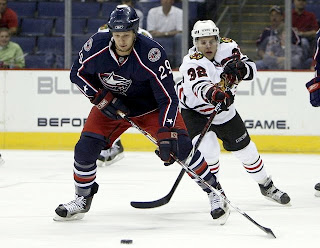
View the photo gallery

Buy your new Blue Jackets jersey!

Flyers, Here's How You Fix It

I think many Philadelphia Flyers fans would argue specifically that if it needed changing, the only thing that would be necessary is an orange jersey instead of a black one. Having said that, the Flyers have already announced plans to introduce an orange third jersey next season.

Still, one fan emailed me this suggestion that extends the sleeve panel down past the elbow and shrinks the stripe around it. Have a look for yourself.


It's a minor tweak that, in my eyes doesn't really look that much different.

On a totally separate note, another fan emailed in an interesting concept that looks at altering the captains' letters.


Any thoughts? I'd love to hear them. Comment below.

By the way, apologies for the limited posts today. I've been a bit under the weather and I'm going to be needing to get to bed soon. Coming shortly will be the uniform review for the Columbus Blue Jackets.

Next up: Dallas Stars.

Poll: Whalers Logo History


1979
1992


We've pretty much gotten through the league by now with the logo history polls. So we're hitting up a couple of deceased teams today and tomorrow. If you think I left out anybody important, feel free to drop me a line in the comments or by email.

Place your vote and then feel free to leave a comment as to how you came to your decision. Tell all your friends to drop in and vote! The more voices heard, the more accurate the results!

Poll opening date
Oct 1 @ 4:23 AM
Poll closing date
Oct 8 @ 11:59 PM


07BONLH | LHHFD

Result: Oilers Logo History

BEST ALL-TIME
1996

59% 2,402 votes


4,089 total votes


1979
41% 1,687 votes


Poll opening date
Sep 23 @ 8:34 AM
Poll closing date
Sep 30 @ 11:59 PM


07BONLH | LHEDM